


AT A GLANCE
Problems found in user testing:
Confusing structure, unclear and broken links, and an outdated and unprofessional design
Goal:
Analyze, breakdown and rebuild the structure and design of ed.gov to make the site more user-friendly, engaging, and professional
Tools used:
Figma
Miro
Photoshop
Accessible-colors.com
Google Drive
Personal Interview and
Data Collecting skills
Project:
Analyze, Restructure & Redesign ed.gov
Span:
3 weeks
UX/UI CASE STUDY
Ed.gov redesign
A UX/UI analysis and redesign of the
U.S. Department of Education's website
Department of Education (Ed.gov) homepage before
Ed.gov homepage after


v
(Big)
The little
website
that could
The story behind
the redesign of ed.gov
By Rachel Hixson
Once there was a very sad government website named ed.gov that had never known the love other websites are shown and was neglected for years.

Mobile before
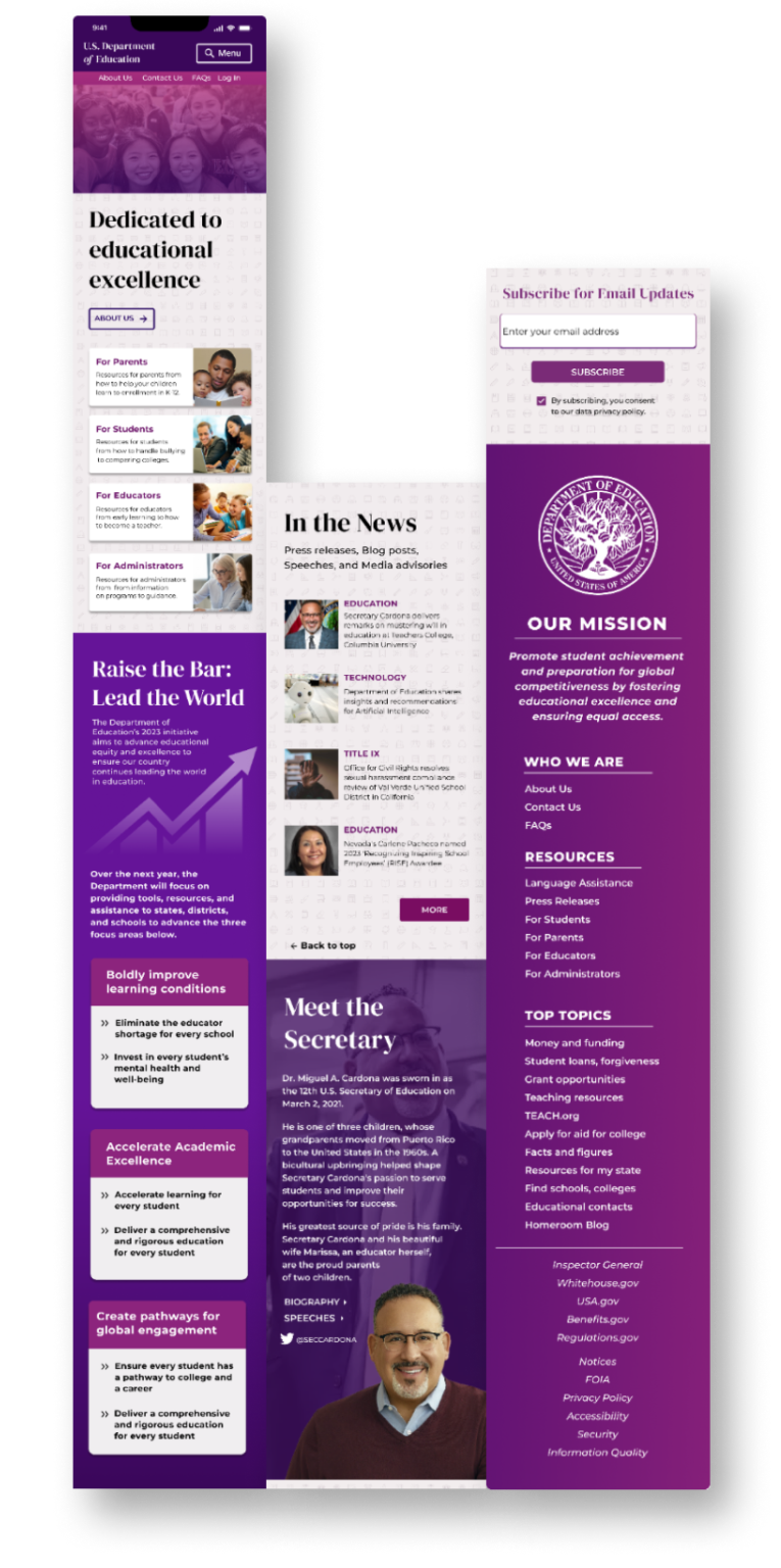
Mobile after
People mocked and ridiculed the site as they passed by, saying nasty and hurtful things.
Here are only a few of the comments the site overheard:
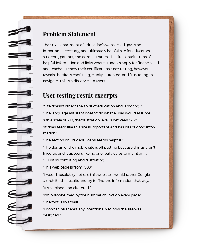
“ This site is boring and ugly.”
“... Just so confusing and frustrating.”
“ On a scale of 1-10, the frustration level is between 9-12.”
“ This web page is from 1999.”
“It’s so bland and cluttered.”
Comments made
during user testing


Finally, a compassionate and curious designer came upon ed.gov and took the time to really get to know it.
Examples of site analyses identifying strengths and weaknesses
The designer discovered that while there was a lot wrong with ed.gov, there was also a lot right. The site clearly had so much to offer - it just needed a little love.
One example of feature analysis and redesign ideas


Inspiration for a new color palette, typography, structure and design
The designer committed to helping the site and began seeing inspiration everywhere for ways to invigorate and build confidence in ed.gov.


Breakdown and restructuring of the site’s primary and secondary navigation
But, before ed.gov could be built up, it first had to be broken down.

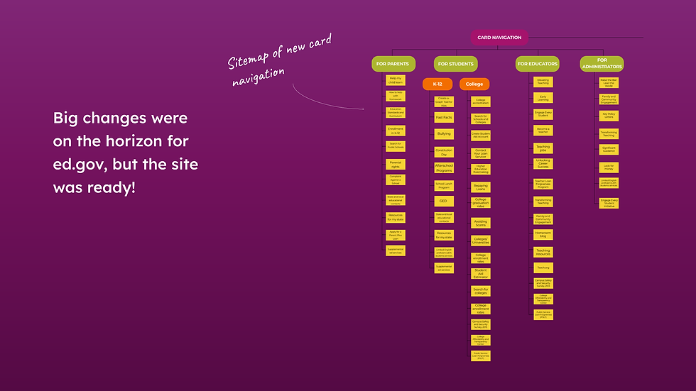
Sitemap of restructured homepage primary navigation
The designer took note of ed.gov’s characteristics and structure, considered the site’s strengths and weaknesses, and formulated a development plan.

Sitemap of new card navigation
Big changes were on the horizon for ed.gov, but the site was ready!

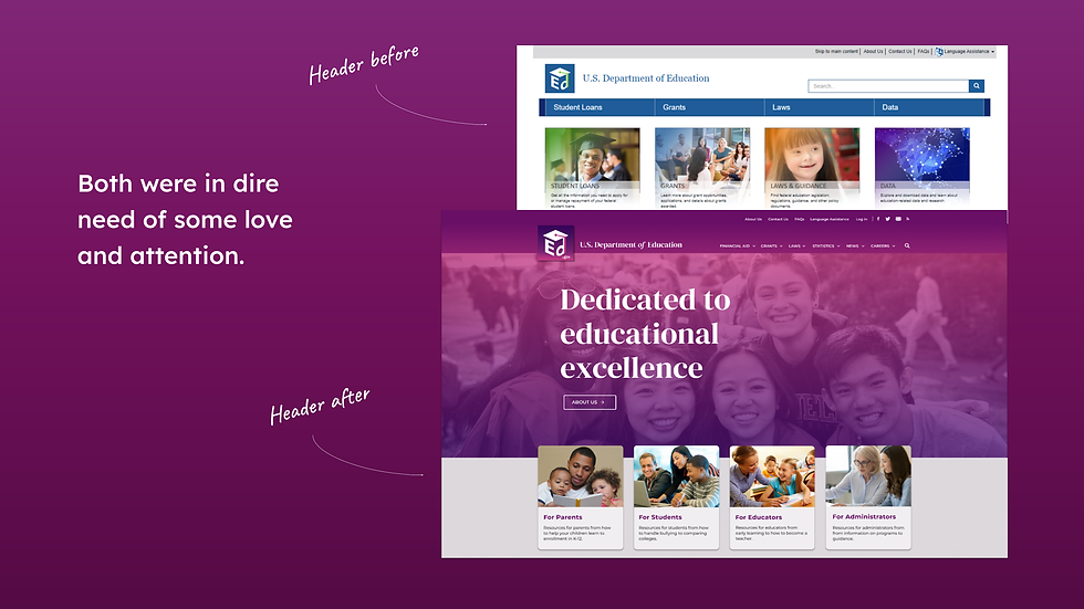
The designer focused first on ed.gov’s header and footer.
Footer before & after


Both were in dire need of some love and attention.


Header before & after
Sketches / Low-fidelity wireframe of homepage
But just making ed.gov look more appealing wasn’t going to cut it.
The designer knew the site’s core characteristics and inclinations had to be addressed first.


.png)


.png)




ALL THE DETAILS
here's a paragraph to paralax dfjkbh dfjkvb akdfjhv ldfvl hflvh vfjlvkv jlfv ZDFJi fb j





the future
Could more
improvements
be made?

define
What are the
problems?
[Annotating site to identify
pain points]


[Proto-persona]
[User flow]
Who will be using this site ...
... and how?
[User testing &
UX/UI analysis]
[User testing
& Problem statement]
[Brainstorming
pain point solutions]
[New website
& mobile app
design]
[User testing]
[Iterations]
[Further
development]
[New site map]
study
Pros for a user ...
... and cons
ideate
How can these
be fixed?
test
solve
What works now ...
Restructure
... and what doesn't?
Redesign
UNDERSTAND
Map of the Journey
STEP 1
Understand
WHO WILL BE USING
THIS SITE AND HOW?

PROTOPERSONA
I developed the protopersona, Maya, based on initial user interviews and testing. The scenario is that Maya’s daughter, Mia, will be heading to college in the fall. She’s started the process of applying to colleges, and Maya would like to help her daughter make an informed decision. Her friend told her she would be able to find tons of helpful information on ed.gov.

user flow
During a second round of testing, users were tasked with finding specific college-related information on ed.gov. Using those results, I developed Maya's likely user flow, which helped solidify pain points. In this user flow, Maya found her friend was correct - all the information she needed could be found on ed.gov. The problem was that the site’s unorganized and confusing structure led her to dead ends and forced her to dig for information.
STEP 2
Study
WHAT WORKS &
WHAT DOESN'T?
USER TESTING
The results of 5 user tests also informed the development of a problem statement. Overall, users were able to track down the correct information but found the site to be confusing, unprofessional, boring, off-putting and - dare I say - offensive.
STEP 3
Define
WHAT ARE THE
PROBLEMS?
UX/UI SITE ANALYSIS
After user testing and analysis of how ed.gov conforms to heuristic principles and accessibility, pages were annotated to further identify pain points.


STEP 4
Ideate
WHAT ARE
SOLUTIONS?


restructure
The site’s existing home page structure was broken down into a site map and then, based on user testing results and card sorting, a new more organized and intuitive home page structure was developed.
REDESIGN
A style guide was developed to evoke energy, vibrancy, and excitement for education.


CURRENT AND REDESIGNED WEB & MOBILE PAGES


STEP 6
Test it
WHAT WORKS NOW
& WHAT DOESN'T

USER TESTING
Results of 5 user tests: Users found the newly restructured and redesigned web and mobile homepage to be more intuitive, professional, purposeful, and inviting.
SUGGESTIONS TO FURTHER IMPROVE ED.GOV
On the desktop, remove the “Learn More” button below the “Raise the Bar” section since there is already one above.
Add “Back to top” buttons in places lower on the desktop and mobile sites so users can quickly get back to the top without scrolling.
Make the primary navigation sticky so that it follows users down the page.
Make all the buttons more uniform and consider making button background darker on disabled state.
ITERATE
The site was, and will be, made more user friendly by applying suggestions gained through user testing.
PLANS TO FURTHER DEVELOP ED.GOV:
STEP 7
The Future
IDEAS FOR FURTHER DEVELOPMENT
PLANS FOR FURTHER DEVELOPMENT
Redesign and rebuild entire site according to new site map and style guide.
Conduct periodic user testing, including 5-second tests, throughout development to continue informing the restructuring and redesign.
Develop and test new features according to user testing results.
Ensure site is fully responsive across all breakpoints.
Once the site is live, update it daily as needed and continue refining the information, design, and features.
future
Development of Ed.gov would continue until the web and mobile sites had been completely rebuilt and were ready to go live. From there, the site would be maintained, updated daily and further refined.


THANK
YOU!
STEP 5
Solve
RESTRUCTURE /
REDESIGN
Low-fidelity wireframe of mobile site
But just making ed.gov look more appealing wasn’t going to cut it.
The designer knew the site’s core characteristics and inclinations had to be addressed first.


And people started to notice.
Comments ed.gov started to hear:
“ It’s not too overcrowded, doesn’t feel intimidating.”
“ It’s looking functional and inviting.”
“ It’s much easier to get a good sense of how and where to find information.”
“ Very clearly a trustworthy and reliable source for information.”
“It’s less cluttered and more professional.”
More user testing
Once ed.gov’s basic, core structure was improved and the site’s confidence increased, it was time for a makeover. Establishing the site’s new style was first up.


Samples of ed.gov’s new style guide
The restructured and redesigned mobile and desktop sites
Using the style guide, ed.gov was then done up and dressed up.

Subpar photo of
user testing
Then came the
big reveal!


Everyone was delighted.
Words of love for ed.gov:
“ Love the colors and the photos.”
“ It makes you feel better about being on the site.”
“ Endlessly better.”
“ It looks purposeful - the other looked accidental.”
“ Love the footer.”
“ Easy to navigate.”
More user testing
There was some constructive criticism.
Samples of advice to further improve ed.gov:
On the desktop, remove the “Learn More” button below the “Raise the Bar” section since there is already one above.
Add “Back to top” buttons in places lower on the desktop and mobile sites so users can quickly get back to the top without scrolling.
Make the primary navigation sticky so that it follows users down the page.
Make all the buttons more uniform and consider making button background darker on disabled state.
Helpful feedback from user testing
In the end, after having received the love and attention it deserved, the site was inviting and exuded confidence.
Recording of homepage navigation
And lived happily
ever after …
(Well … with routine
maintenance
and development!)
v

